Background
Growing up I spent my summers going to local ice cream shop. Now that I can make my own I want to create a fully realized brand.
Personal Work
01/30/25
Early Designs
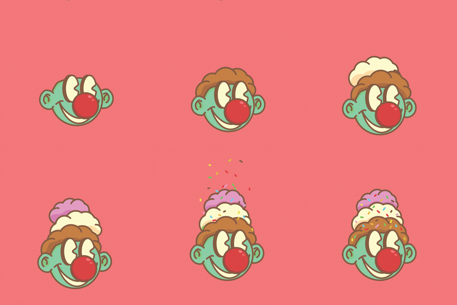
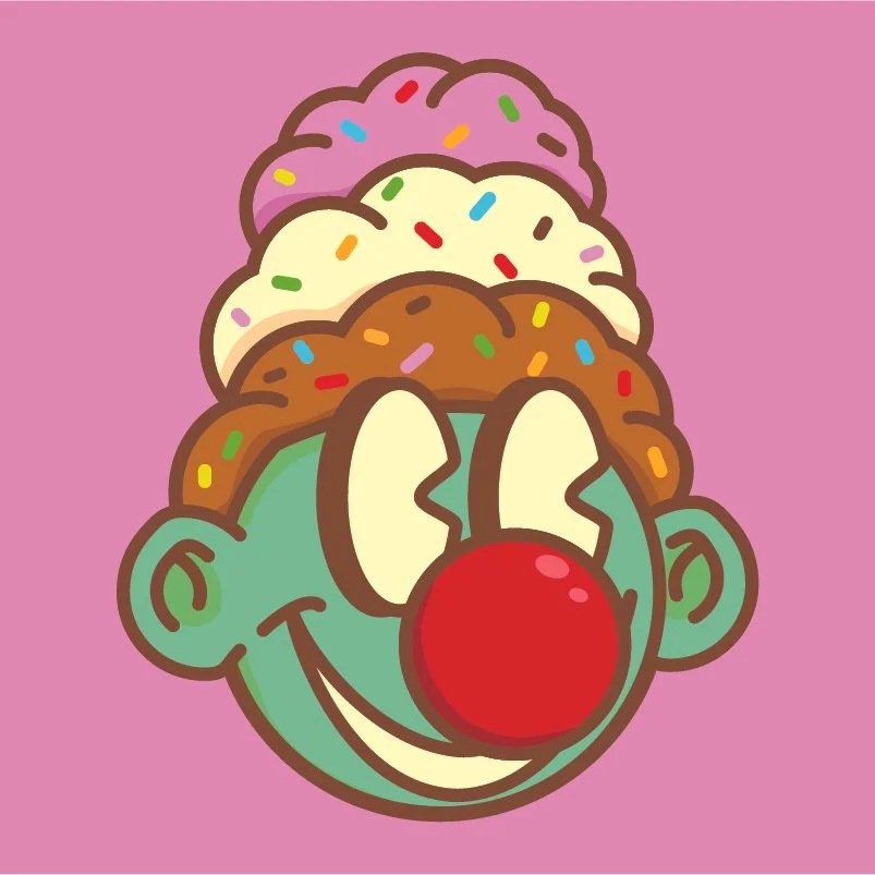
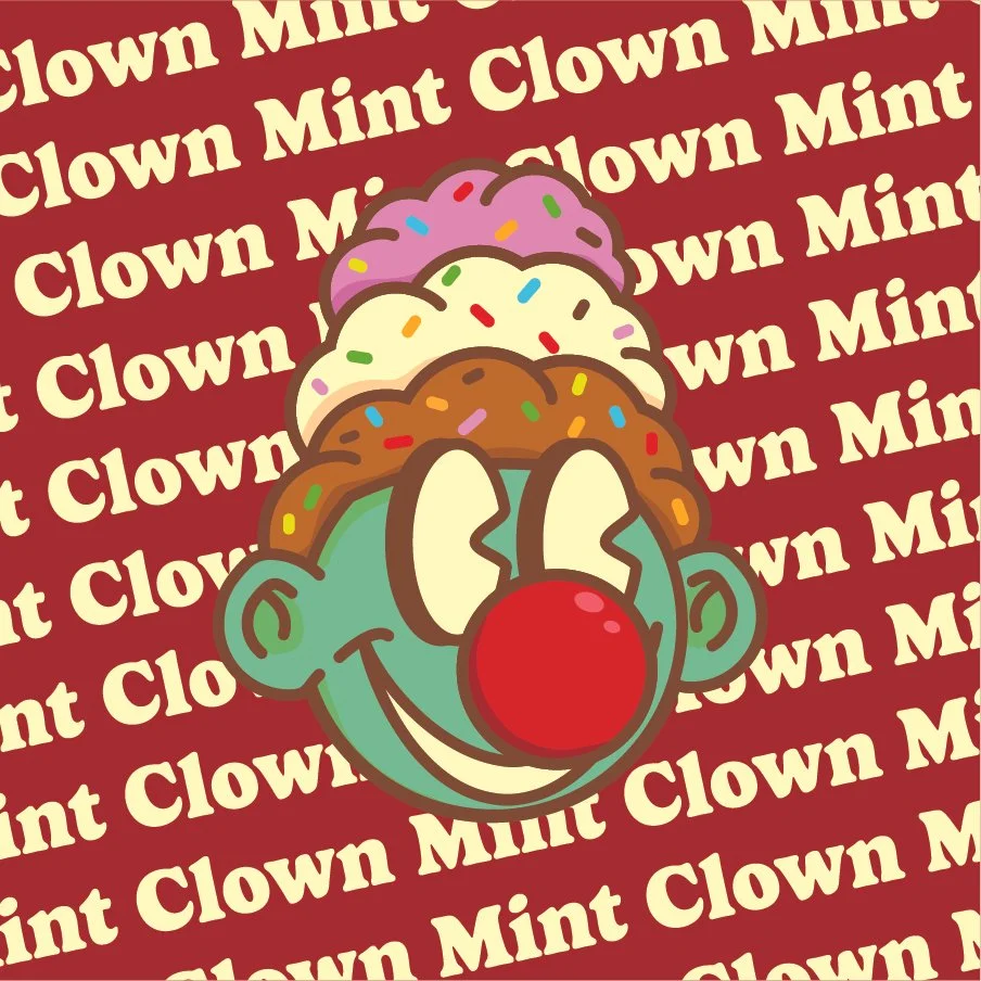
I started by wanting to create a mascot logo. I also wanted to make a happy and fun brand identity. This naturally led me to an ice cream brand. After working on the character and editing his face and skin color, I added a red cherry nose. This looked like a clown nose, so I went fully in, adding the ice cream hair because it looked similar to bushy clown hair
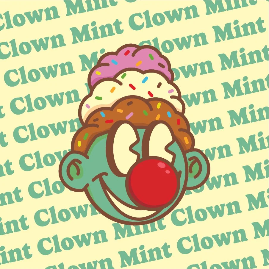
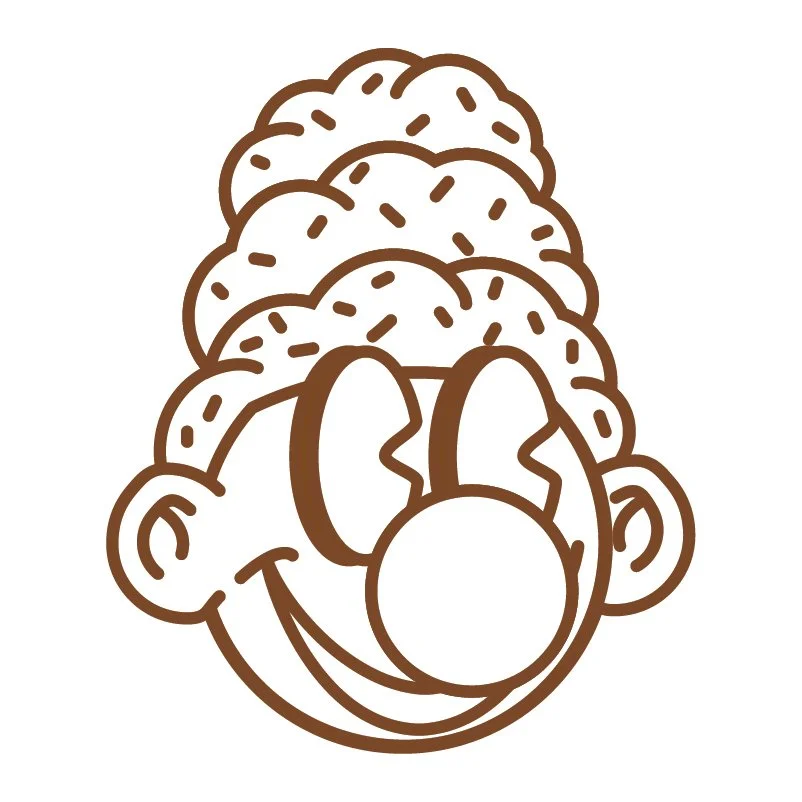
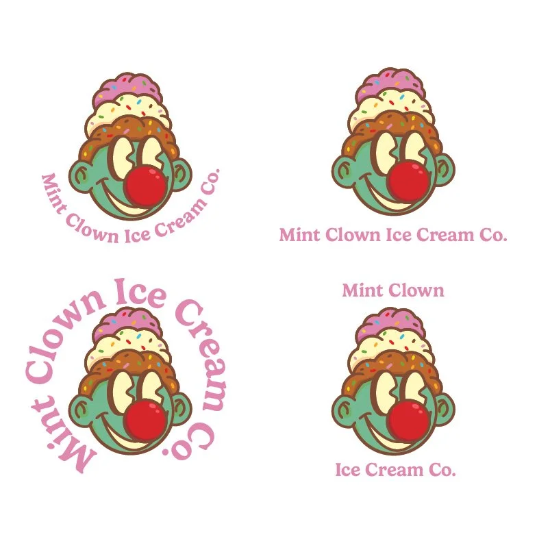
After creating the logo, I wanted to add more content. I continued to experiment with color and text until I made many different mockups of the same image. I wasn't too happy with the layout of the text, so I experimented with its size and orientation. I also got the Idea to animate the clown, so later on, I went in and made it using After Effects.
The Text
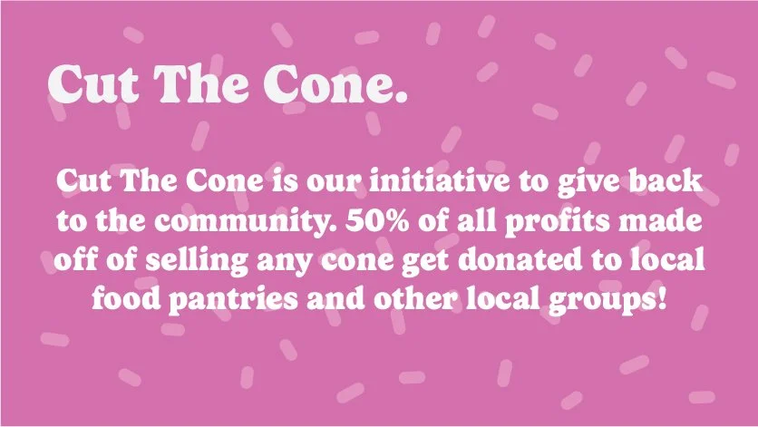
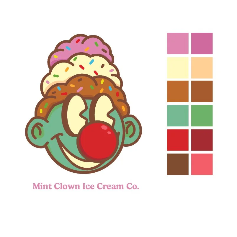
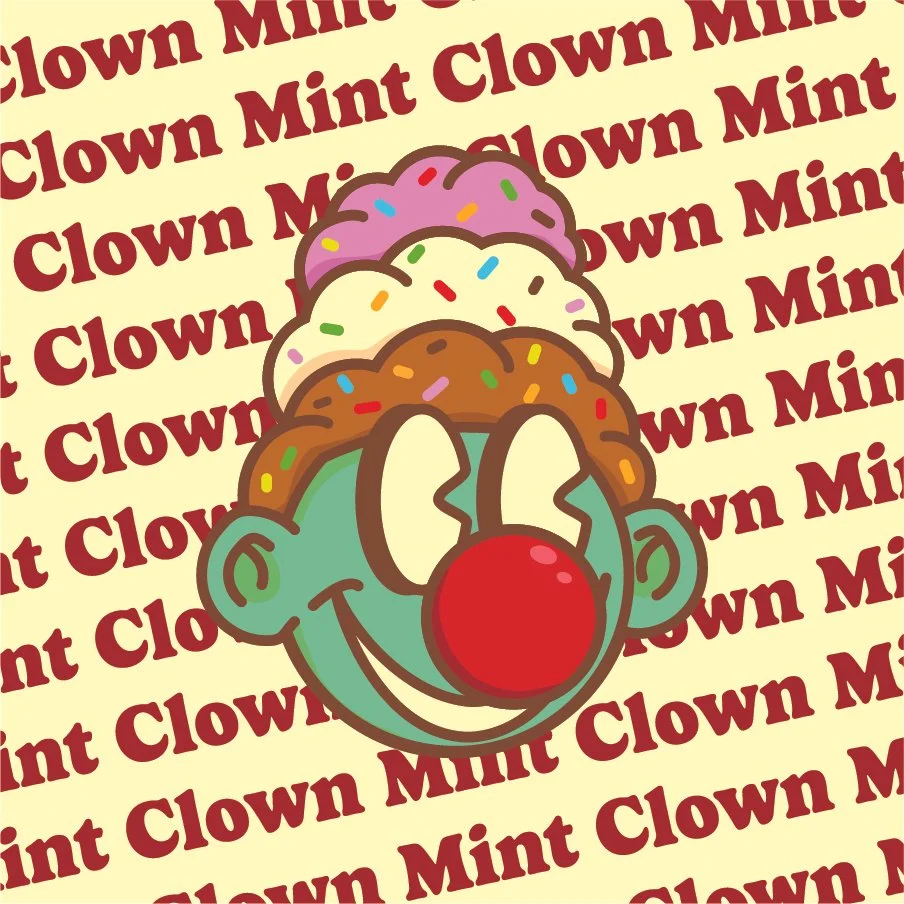
After the mark was done, I wanted to find more use for the text. I loved the font I picked and needed to see it in action. First, I made a mini brand identity, which I’ve become very fond of. Though it doesn’t show every wrong size or color combo, it does lay out the font and colors efficiently. I also made these “facts” pages, which show off the font and tell a little bit about the company. Experimenting with text further I made a whole menu, made up flavors included. Looking back on the project, this is what I would have spent more time on, but at the time, I grew bored of the text and wanted to move on to the animation.
The Facts Pages
Different Uses of Text and Image
Animation
First I sketched out ideas on paper. Then breaking up the logo in Adobe Illustrator, I created the face, scoops, and sprinkle layers. Bringing them into After Effects, I keyframed them falling with the head reacting and bobbing down with the impact. I still wasn’t happy with it, so going back in, I added the sprinkles in two layers, making it look more natural. I also pushed the ice cream to the side, creating a charming and fun effect.

